Context
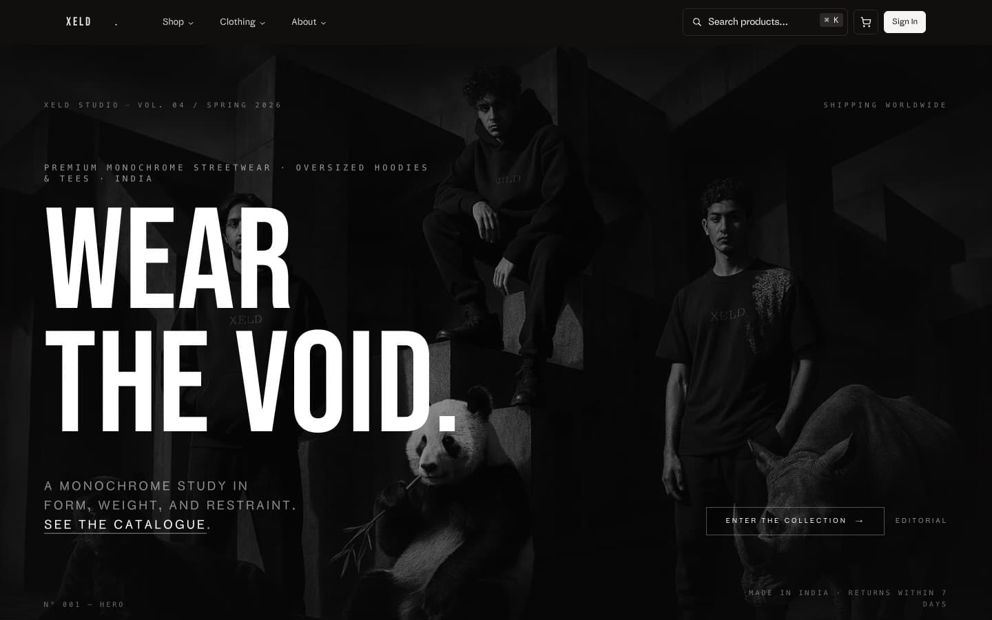
XELD Studio is a premium monochrome streetwear label born out of Bangalore. Its garments are minimal, considered, and slightly austere — they do not look like anything else on a retail shelf. The founders did not want them to be sold like anything else either.
Problem
The label had the brand. It did not have the surface. Existing Shopify themes turned the catalogue into a generic e-commerce template, undoing the editorial restraint of the garments. Conversion was decent, but every interaction quietly told customers: this is the same as everywhere else. The cart drawer animated like every other Shopify cart. The product card looked like every other product card. The label that fought for distinction in its design was losing it in its commerce.
Approach
We rebuilt the storefront from the type up. Every component — product card, cart drawer, checkout step — was designed as if it were a page in an editorial. The Shopify backend stayed (catalogue, inventory, payments, fulfilment) but the surface became fully custom Next.js, with the Storefront API feeding a typed cart layer. We wrote a small design system whose rules read more like an editorial style guide than a component library.
System
/ the things actually shipped
- 01
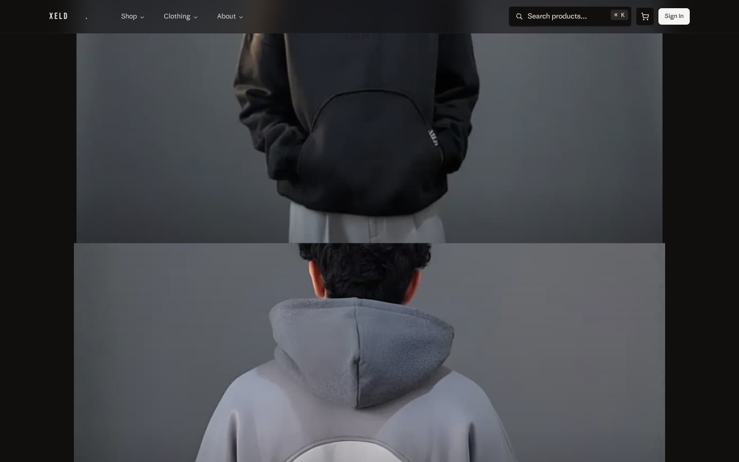
Editorial product detail with cinematic gallery, fixed-side spec sheet, and inline size guidance — no tabs, no accordions, no information hiding.
- 02
Cart-as-margin: a slide-in drawer that quietly carries state across sessions, persisted via the Storefront API, with zero modal noise.
- 03
Single-page checkout backed by Shopify Hydrogen patterns — five fields, three taps, done.
- 04
Pre-rendered category and content pages with on-demand revalidation; everything else streams via React Server Components.
- 05
Image pipeline tuned to AVIF with art-directed crops per breakpoint — the hero on mobile is a different photograph from the hero on desktop, not a cropped version of the same one.
- 06
A typed Storefront API layer that gives every component the exact product shape it expects — no `any`, no field-by-field defensive checks.
In Practice
Live captures from the shipped product, recorded for this case study.
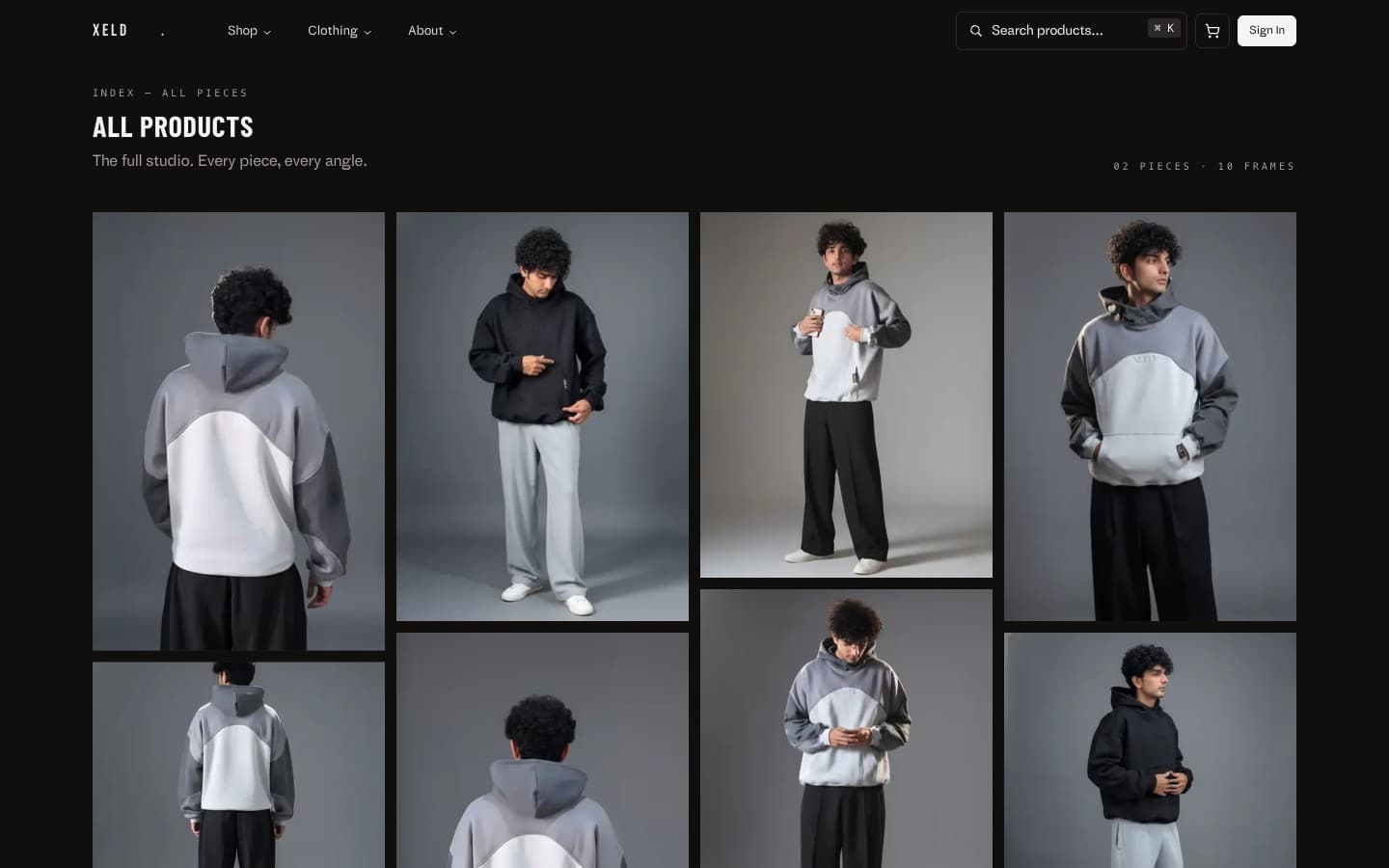
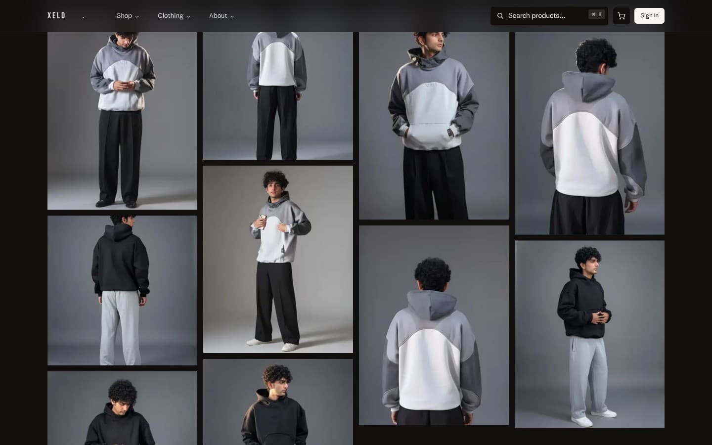
How the pieces fit.
Architecture
- Next.js App Router
- TypeScript
- Tailwind v4
- Custom design system
- Shopify Storefront API
- Hydrogen patterns
- Typed cart layer
- Order webhooks
- Vercel Edge
- Sharp + AVIF pipeline
- ISR for catalogue
- Web Vitals
- Sentry
- Vercel Analytics
- Real-user LCP tracking
Outcome
XELD now has a storefront that feels authored — closer to a magazine than a marketplace. Time-to-interactive dropped sharply, cart abandonment fell, and the brand can publish a drop the same way it would publish an editorial: as content first, commerce second. New collections ship on the same day the photography lands, instead of three days later.
Learnings
/ what would be different next time
- /01
A monochrome brand does not mean a monochrome interface — restraint comes from typography and pacing, not just the palette.
- /02
Pre-rendering wins a benchmark; art-directed image crops win the feel.
- /03
Cutting checkout from four steps to one removed the cart-abandonment story almost entirely.
- /04
The smallest carry-over from a Shopify theme — even a default toast — visibly breaks the editorial spell. We replaced every default.